
A flat sprite is a silhouette filled with colour. Shading is what turns it into an object: a ball instead of a disc, a helmet instead of a grey patch. The good news is that pixel art shading is less about talent than about a few decisions made in the right order — where the light comes from, which side of the form turns away from it, which colour each step uses, and where to stop. This tutorial walks through those decisions, names the two mistakes almost everyone makes first (pillow shading and banding), covers when dithering earns its place, and then has you shade a sphere yourself in Tsubu, in a browser tab, judging the result at the size a player would see it.
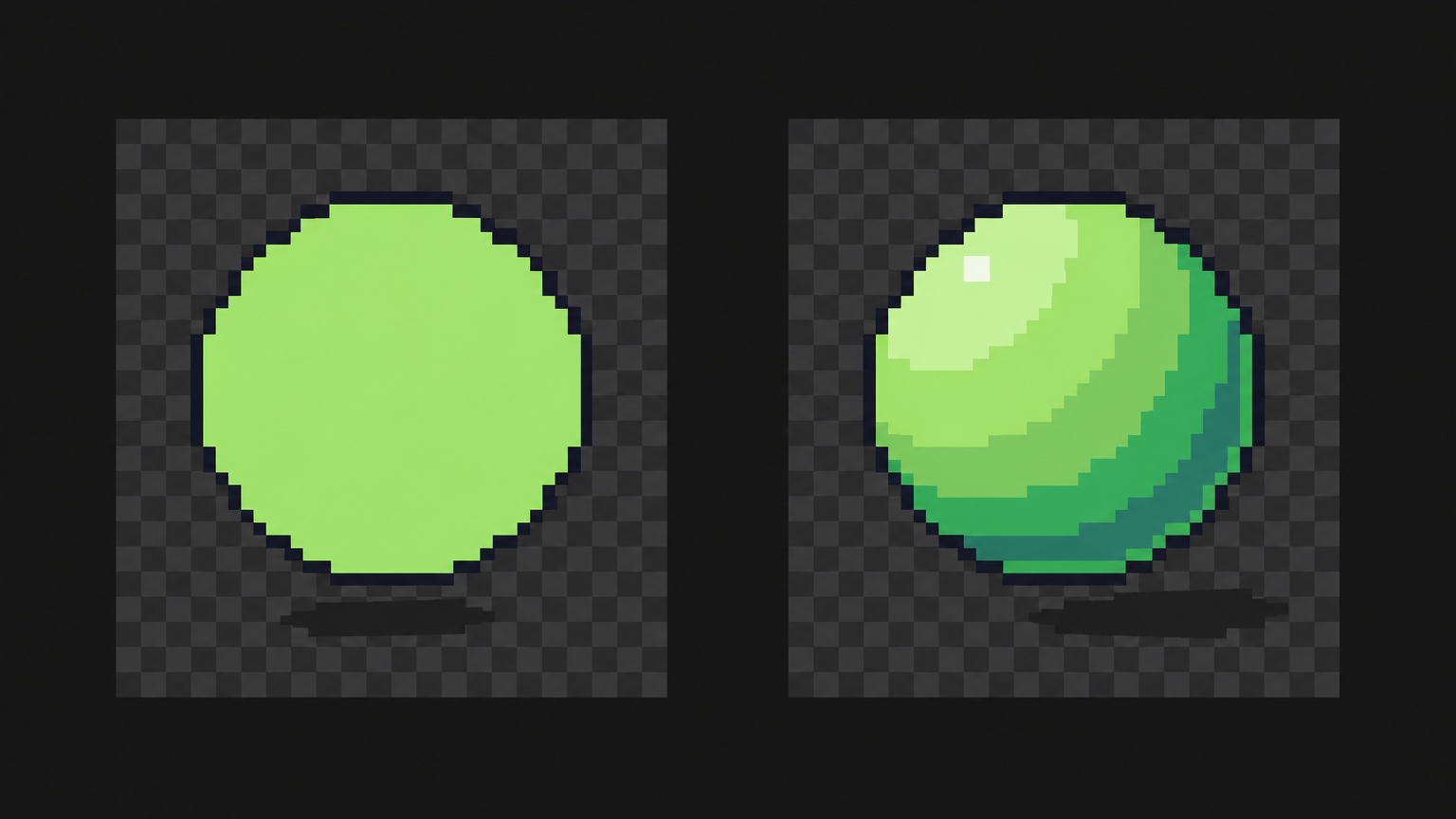
Pick one light source and commit to it
Every shading decision follows from one question: where is the light? Answer it before you place a single shadow pixel, and then keep the answer. A sprite lit from the upper left on one side and the upper right on the other doesn't read as "well lit"; it reads as wrong, even to people who can't say why.
Upper left is a common default in tutorials, and it's a reasonable one to start with. What matters more than the exact angle is that every sprite in the same game shares it. A character lit from the left walking past a crate lit from the right looks pasted in. If you're making assets for a game, write the light direction down and treat it like the palette: a project-wide decision, not a per-sprite one.
A single light doesn't mean one flat angle for everything. It means the light has a direction, and each surface is lit according to which way it faces. Surfaces facing the light get the lightest colours, surfaces turning away get darker ones, and the boundary between them follows the shape of the object — not the shape of its outline.
Form shadows and cast shadows
There are two kinds of shadow, and beginners usually draw only the first.
- Form shadow is the dark side of the object itself: the part of a sphere, an arm or a barrel that faces away from the light. It wraps around the form. On a sphere lit from the upper left, it's a crescent on the lower right that is thickest at the bottom right and thins out as it curves round.
- Cast shadow is the shadow the object throws onto something else — the ground, a wall, another part of the same character. It sits on the side opposite the light, and its shape comes from both the object and the surface it lands on. A sphere on a floor casts a flattened oval; an arm in front of a torso casts a band across the chest.
The darkest pixels on a sprite are usually where the two meet: the thin line where the sphere touches the floor, the crease under an arm. Putting your deepest colour there, and only there, anchors the object to its surroundings. A sprite with form shadows but no cast shadow tends to look like it's floating — which is sometimes what you want for a pickup or an icon, but should be a choice.
Shade with the ramp, not with "darker"
Once you know where the shadows go, you need colours for them. The beginner move is to take the base colour and darken it. The result tends to look muddy: same hue, less light, no life.
Instead, shade by stepping along a ramp — a short run of colours for one material, ordered dark to light, where the hue shifts as well as the lightness. In the Sweetie 16 palette used in the exercise below, the greens run #a7f070 → #38b764 → #257179: a yellow-green, a green and a teal. Shading a green ball with that ramp means its shadow turns teal, not grey-green, and its lit side leans yellow. Why ramps are built that way, and how to choose or build one, is a colour question rather than a shading one; it's covered in how to choose a pixel art colour palette. For shading, the rule is simple: each step darker is the next colour down the ramp, never a new colour mixed on the spot.
Use as few steps as the form needs. A small sphere reads with a base, one shadow, one light and a highlight. Every extra step has to cover a patch of pixels big enough to be seen, and at 16 × 16 or 32 × 32 there aren't many patches to go around.
Pillow shading, and why it looks flat
Pillow shading is shading from the outline inwards: a dark ring just inside the outline, a lighter ring inside that, the lightest colour in the middle. It's the most common first attempt because it feels like shading — there are darker and lighter pixels — but the object comes out looking like a cushion, puffed up and flat at once.
The Pixel Joint community tutorial by cure, one of the long-standing references on the craft, puts the problem precisely: pillow shading "pays no attention to the light source, and conforms to the shape of the area rather than the form it represents." It adds that the fault isn't a frontal light as such — you can light a sprite from the viewer's direction, "so long as you pay attention to the forms." (The Pixel Art Tutorial, Pixel Joint.)
The fix is the section above: decide the light, then let the shadow sit on the side of the form facing away from it. If your dark colour touches the outline evenly all the way round, you've pillow-shaded.
Banding: when the steps line up
Banding is subtler. It happens when the edges of neighbouring colour bands line up on the pixel grid — each band a copy of the one next to it, shifted a pixel over, with their stair-steps starting and ending in the same rows and columns. The same tutorial describes it as "when pixels line up": the grid "immediately becomes more evident, the pixels are exposed, and the apparent resolution becomes less fine." Instead of a smooth turn from light to shadow, you see a stack of parallel stripes.
Banding often rides along with pillow shading, because rings that follow the outline naturally mirror its steps. But it also shows up in otherwise well-lit sprites. Ways out:
- Vary the band widths. A shadow band that is two pixels wide in one place and three in another stops mirroring its neighbour.
- Stagger the step ends. If the light band's step ends at the same column as the base band's step, move one of them by a pixel.
- Use fewer bands. Two well-placed tones usually beat four thin, parallel ones on a small sprite.
- Break the edge with clusters or dithering, covered next — sparingly.
Dithering: where it helps and where it's noise
Dithering mixes two colours in a pattern — most often a checkerboard — so that at a distance the eye blends them into an in-between tone. It gives you a transition without adding a colour to the palette, which is why it's a classic pixel art technique. Cure's tutorial describes it as a way "to ease the transition between two colors, without adding any new colors to the palette," also useful for texture — and names overuse as "the most common mistake."
As a rough guide, which you should test rather than trust:
- It tends to help on larger areas where you have room for the pattern to blend: big spheres, skies, backgrounds, a gradient across a wall. It also works as texture on rough materials — stone, sand, fabric — where a little visual noise is the material.
- It tends to read as noise on small sprites, where a checkerboard strip is two pixels of detail you can't spare, and on small smooth materials like skin or metal, where it looks like grit. On sprites that move, a dithered patch can also shimmer as it shifts across the screen.
- Keep it to edges. Cure's advice is to use dithering "to taper the ends and edges" of a field of colour, not to fill whole areas with it. A narrow strip along a boundary between two ramp steps is the typical use.
The only reliable test is the same as for every other shading choice: look at it at 1×. If the dithered strip blends into a softer transition, keep it. If you can see the checkerboard, it's noise at that size.
Try it: shade a sphere, step by step
A sphere is the classic shading exercise because it has nothing to hide behind: no outfit or face to distract from where the light is. Everything below happens in Tsubu's browser pixel art editor, with nothing to install. Sign in with Google — it's free while we're in early access. Allow about fifteen minutes.
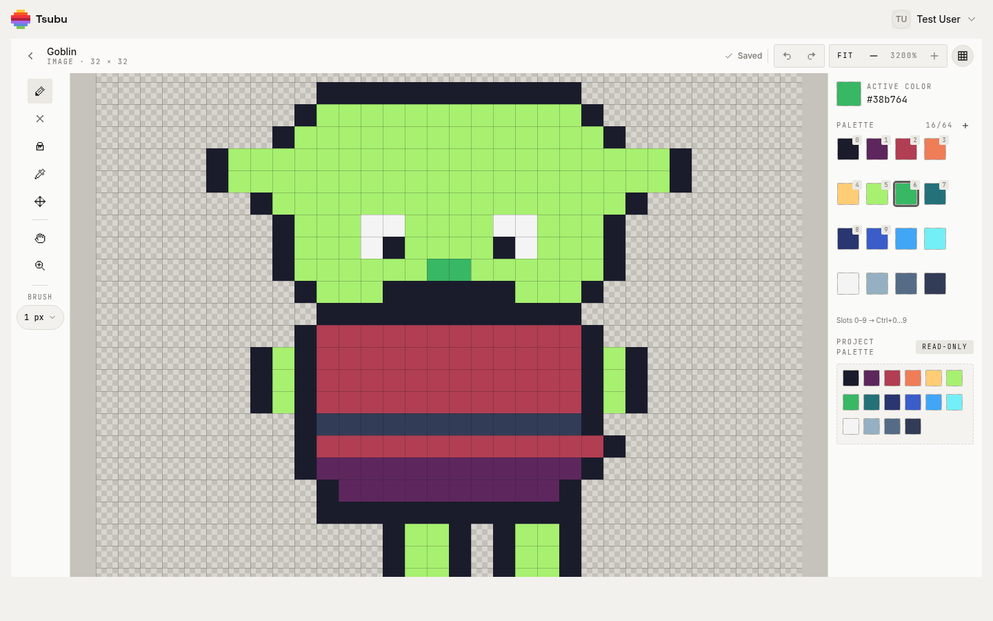
That's the editor set up to shade, before any shading is painted: a 32 × 32 sample goblin at 3200% with the pixel grid on, the pencil active at a 1 px brush, and #38b764 — the green one step down from the goblin's lime skin — as the active colour. On the right, the palette panel lists the ramps you'll shade with: slots 5–7 are the green ramp, 8–11 the blues, 12–15 the greys, with slots 0–9 on the Ctrl+0…Ctrl+9 hotkeys. The exercise uses a simpler form than the goblin, drawn by you.
1. Make a project and a 32 × 32 image. Create a new project and leave its palette section off; a new project starts on the Sweetie 16 palette. Add a new asset, set Type to Image, name it sphere-flat, leave the grid at 32 × 32, create it and open it.
2. Draw the flat form. Press Ctrl+0 for the near-black outline colour and the pencil (B), and draw a circle about twenty pixels across, a little above the centre so there's room for a shadow underneath. Keep the stair-steps of the curve changing length gradually; a lumpy outline will fight every shadow you put inside it. Then press Ctrl+6 for the mid green #38b764, switch to the bucket (G) and click inside the circle. The bucket fills one connected patch of exactly the colour you click and doesn't leak through diagonal steps in the outline, so a closed circle fills cleanly.
3. Keep a copy to pillow-shade. Back in the library, right-click the sphere-flat card and choose Duplicate. Open the copy and pillow-shade it on purpose: with Ctrl+7 (the teal #257179) run a ring just inside the outline all the way round, then put a patch of Ctrl+5 (the lime #a7f070) in the dead centre. Leave it there for comparison and go back to the original.
4. Commit to a light. Upper left. Say it out loud if you have to; every step from here depends on it.
5. Place the form shadow. With Ctrl+7, paint the crescent on the lower right: thickest at the bottom right, thinning as it curves up the right side and along the bottom, and never touching the upper-left part of the outline. Make its inner edge a curve that follows the sphere's roundness, not a copy of the outline shifted one pixel in — that's banding in the making.
6. Light the lit side. With Ctrl+5, paint a broad patch on the upper left, set in from the outline and off-centre toward the light. Its edge against the mid green should be a soft curve roughly parallel to the shadow's edge, but not step-for-step identical to it.
7. Add a highlight. A few pixels of Ctrl+4 (the pale yellow #ffcd75) inside the lit patch, toward the upper left. Keep it small: two to four pixels on a sphere this size is plenty. If you want the ball to look glossier and colder, click the off-white #f4f4f4 in slot 12 instead.
8. Ground it. Click the dark slate #333c57 in slot 15 and draw a flattened oval under the sphere, offset slightly to the right — the cast shadow, on the side away from the light. Then press Ctrl+8 for the navy #29366f and put a short line of it along the bottom-right edge of the sphere where it meets its shadow. That's the darkest point of the whole sprite, and it's what stops the ball floating. If you need a colour that's already on the canvas, hold Alt to pick it straight off the canvas with the eyedropper.
9. Judge it at 1×. Press - until the zoom readout says 100%. That's the sprite at the size a game would show it. Then go to 50% and 25% and squint. You should still see one lit side, one dark side and a shadow on the ground. Tsubu doesn't have a greyscale preview, so zooming out and squinting is the value check here. Now open the pillow-shaded copy and do the same. At 100% the difference is usually obvious: one looks like a ball sitting on a floor, the other like a badge.
10. Try dithering, then decide. Back on the original, zoom in again and pick a stretch of the boundary between the mid green and the teal shadow. With the pencil, replace a two-pixel-wide strip along it with a checkerboard of the two colours. Zoom back to 100% and look. Does the turn from light to shadow get softer, or can you see the pattern? On a 32 × 32 sphere, it can go either way depending on how long the strip is; that's the point of looking. If it's noise, Ctrl+Z takes it back stroke by stroke (Ctrl+Y redoes).
Work saves as you go; the header shows Saved once it's stored. When the sphere works, try the same four decisions — light, form shadow, lit side, cast shadow — on something less forgiving: a barrel, a helmet, the goblin in the screenshot above.
From one sphere to a whole game's sprites
The sphere teaches the order of operations; real sprites are just several simple forms stuck together. A character's head is a sphere, the torso a box, the arms cylinders, each shaded from the same light and each casting a little shadow on its neighbours. Shade the big forms first and details last, and check at 1× after each one.
When the shading holds up, the sprite's next stop is usually an engine. Getting pixel art into Unity, Godot, Phaser or Pixi covers grid-true export and the one import setting — nearest or point texture filtering — that keeps your shadows crisp instead of blurred. If you haven't picked the colours your ramps come from yet, start with the palette guide; if you're still earlier in the process, how to make pixel art for games covers the fundamentals from a blank canvas to export.
Now shade something
The whole method fits in one line: pick a light and keep it, put the form shadow on the side facing away, ground the object with a cast shadow, step along a hue-shifted ramp instead of darkening, and judge every choice at 1×. Pillow shading and banding are what happen when shadows follow the outline instead of the form; dithering is a tool for edges, not a fill.
Open the editor and shade your first sphere — free while we're in early access, sign in with Google. New tutorials land on the RSS feed.