
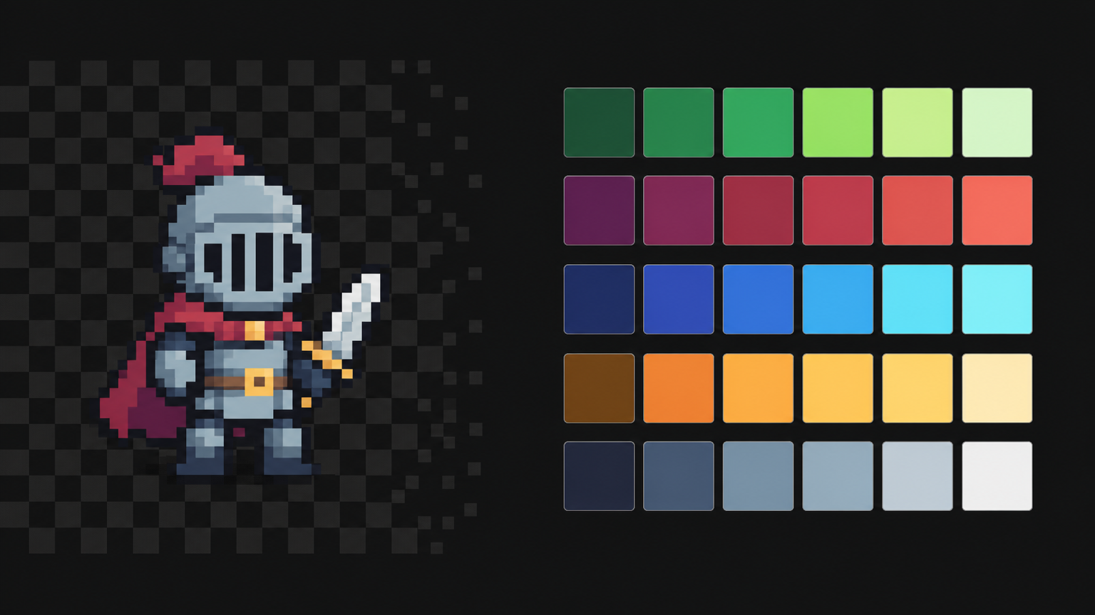
Most pixel art that looks "off" isn't badly drawn. It's badly coloured: too many colours, shadows that are just the base colour with the lights turned down, and neighbouring areas so close in brightness that they melt into one blob at actual size. The fix is not a better colour wheel. It's a small palette built from a few ramps, and the habit of checking it on a real sprite at 1× instead of admiring it as a row of swatches. This guide covers the questions people actually ask about pixel art palettes — how many colours, how to build a ramp, what hue shifting is, why value contrast matters more than hue, and whether to use a community palette or make your own. Then you test all of it on a sprite of your own in Tsubu, in a browser tab.
How many colours does a pixel art sprite need?
Fewer than you think, and the number scales with the canvas. A 16 × 16 sprite has 256 pixels in total; every extra colour you add has to earn a patch of them, and at that size there isn't much room to go around. These are rules of thumb, not laws, but they are where most people land:
| Canvas | Colours per sprite (outline included) | What that buys you |
|---|---|---|
| 8 × 8 or 16 × 16 item or icon | 3–6 | an outline, one material in two or three tones, a highlight |
| 16 × 16 character | 4–8 | one or two materials, each as a short ramp |
| 32 × 32 character | 8–16 | skin, cloth, metal — each its own three- or four-step ramp |
| 64 × 64 and up | 16 or more | longer ramps, more materials, room for subtle transitions |
Two numbers get confused here. One is how many colours a single sprite uses. The other is how many your whole game draws from — a shared palette of 16 or 32, with each sprite picking a subset. The second number is what makes a game look like one game; the first is what keeps each sprite readable. Pick the game palette first, then let each sprite use as little of it as it can get away with.
A small palette is not an aesthetic affectation. It forces decisions: with three greens you have to decide which one is shadow, which is the body and which is light, and that decision is most of the work of making a sprite read.
Build palettes out of ramps, not loose colours
A ramp is a short run of colours for one material, ordered from dark to light: shadow, base, light, maybe a deeper shadow and a highlight at either end. Three to five steps is typical for a sprite; Slynyrd's Pixelblog 1 on colour palettes builds nine-step ramps for its full Mondo palette, but its advice for a first attempt is to start with a small one.
Thinking in ramps changes how you pick colours. You stop asking "which green?" and start asking "which three greens, in what order, with how big a step between them?" A good ramp has:
- Even-feeling steps in lightness. Each colour clearly darker than the next. If two steps look nearly the same at actual size, one of them is wasted.
- A clear darkest and lightest. The ends do the heavy lifting — the dark end separates the sprite from its background, the light end tells you where the light is.
- Reuse across materials. The darkest step of your green ramp can often double as the darkest step of your blue one. Shared ends are how a small palette covers more materials without growing.
Hue shifting: why darker shouldn't just mean darker
The beginner way to make a shadow is to take the base colour and lower its brightness. The result is called a straight ramp, and it tends to look muddy and grey — the colour gets dimmer without getting any more interesting.
Hue shifting means rotating the hue a little at each step of the ramp as well as changing the lightness. The common convention is that darker steps lean toward cool hues (blue, purple) and lighter steps lean toward warm ones (yellow). Slynyrd's Pixelblog suggests a shift of around 20 degrees per swatch and notes that saturation tends to peak in the middle of a ramp and fall off toward the ends — the very bright, very saturated corner is where "eye-burning" colours live.
You can see it in the hex codes of a palette many people start with. Sweetie 16 — more on it below — has a warm ramp that runs:
#1a1c2c → #5d275d → #b13e53 → #ef7d57 → #ffcd75
That's a near-black with a blue cast, a plum, a red, an orange and a pale yellow. Five steps of lightness, and the hue travels from cool to warm the whole way up. Its green ramp does the same thing in miniature: #257179 (a teal) → #38b764 (a green) → #a7f070 (a yellow-green). The dark end isn't a darker green, it's a teal.
Hue shifting is a colour-choice decision you make when you build the palette. How you then place those colours on a form — light direction, where shadows fall, dithering — is shading technique, which is a topic of its own and not what this post is about.
Value contrast is what keeps small sprites readable
Value is how light or dark a colour is, independent of its hue. At 16 or 32 pixels tall, value is what the eye reads first: a player sees shapes as patches of light and dark long before they register that one patch is red and the next is green. Two neighbouring areas with different hues but similar values merge into one blob at actual size, however different they look as swatches.
Practical consequences:
- Neighbours need a value gap. Hair against skin, a sword against a sleeve, a character against the ground. If two adjacent areas are close in lightness, move one of them along its ramp.
- Don't trust the colour picker's numbers alone. The V in an HSV picker is not perceived lightness: pure yellow and pure blue can share a V of 100 % and look nothing alike in brightness. Your eyes are the arbiter.
- Judge at the size the player sees. Zoomed in at 800 %, every colour looks distinct. At 100 % you find out which ones actually are. Zooming further out, or squinting, exaggerates the test: if the sprite still reads as a shape, the values are working.
A common self-check elsewhere is to desaturate the sprite and look at it in greyscale. Tsubu doesn't have a greyscale preview, so in the exercise below the check is done by zooming out below 100 % and squinting — cruder, but it answers the same question.
Community palettes or your own?
Both are legitimate, and most people should start with a community palette.
Established palettes are made by pixel artists, tested across many projects, and built with the ramp and hue-shift logic above already done. Some worth knowing:
- Sweetie 16 by GrafxKid — sixteen colours (Lospec page) that are mostly four hue-shifted ramps, as the hex codes above show. It's also the default palette for new TIC-80 cartridges.
- DawnBringer 32 by DawnBringer — a widely used 32-colour general-purpose palette (Lospec page).
- The Lospec palette list — a large searchable directory of community palettes you can filter by colour count, with each palette credited to its author.
These palettes belong to the people who made them. If you ship a game on one, credit the author — it costs nothing and it's how the scene works.
Making your own is worth it once you know what you need: a specific mood, a material the community palettes don't cover, a game with a very particular look. The recipe is the one above — pick your materials, build a three- to five-step ramp for each with a hue shift, share the dark ends, and test every ramp on a real sprite before you commit. The trap is making a palette in the abstract: swatches that look lovely in a grid and fall apart on a 32 × 32 character. Which is why the rest of this post is an exercise.
Try it: five colours, one sprite, two ramps
Everything below happens in Tsubu's browser pixel art editor, with nothing to install. Sign in with Google — it's free while we're in early access. The exercise takes about fifteen minutes: build a tiny sprite on a deliberately limited palette, judge it at 1×, then change a shadow's hue and swap a whole ramp, and watch what each change does.
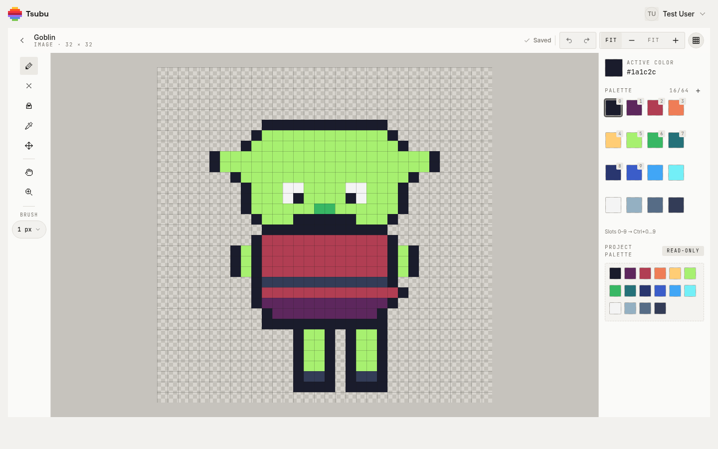
That's the editor with a 32 × 32 sample goblin sprite open: pixel grid on, the tool rail on the left, and on the right the asset's palette — PALETTE 16/64 — with the first ten swatches badged 0–9 for the Ctrl+0…Ctrl+9 hotkeys. Below it sits the project palette, marked read-only: the shelf every asset in the project shares. The goblin itself uses only a handful of those sixteen colours, which is the point.
1. Make a project and a 16 × 16 image. Create a new project and leave its palette section off; a new project starts on Sweetie 16. Add a new asset, set Type to Image, name it slime-palette, set the grid to 16 × 16, create it and open it. The palette panel reads 16/64: a blank asset starts with a copy of its project's palette.
2. Read the ramps before you touch them. Look at the swatches in order. Slots 0–4 are the warm ramp from earlier, near-black to pale yellow. Slots 5–7 are lime, green and teal — the green ramp, listed light to dark. Slots 8–11 are navy through blue to cyan; slots 12–15 are a light-to-dark run of blue-tinted greys. Sixteen colours, four ramps, and you've just found them by reading the panel.
3. Cut the palette to five. Keep #1a1c2c (outline), #257179, #38b764 and #a7f070 (the green ramp) and #f4f4f4 (a highlight). Hover every other swatch and hit the small × beneath it until the counter reads 5/64. Nothing is lost: the project palette below still holds all sixteen, and the + on any shelf swatch pulls it back into the asset. Then drag the three greens into dark-to-light order right after the outline, so Ctrl+1, Ctrl+2 and Ctrl+3 walk up the ramp.
4. Paint it flat. A slime is a blob with eyes, which is exactly why it's a good palette test: all the interest comes from the colours. Draw a rounded outline in slot 0 with the pencil (B), then fill the inside with the middle green using the bucket (G). Put the dark teal along the bottom where the slime meets the floor, a band of the light green across the top, one or two pixels of #f4f4f4 as a shine and two dark pixels for eyes. Keep it rough. This isn't a shading lesson; you're placing three values so you can judge them.
5. Judge it at 1×. Zoom out with - until the readout says 100%. That's the sprite at the size a game would show it. Then go further — 50%, 25% — and squint. Can you still see top, middle and bottom as three separate bands? If two of them merge, their values are too close; that's the single most useful thing this exercise will tell you.
6. Compare a hue shift with a plain darken. Click the middle-green swatch so it becomes the active colour, then click the Active color square at the top of the panel to open its picker. Drag the point straight down in the square — darker, same hue, no touching the hue rail — and hit + next to the palette counter to add that colour as a new swatch. With it selected, click the teal shadow with the bucket; the fill replaces one connected patch of exactly that colour, so click again if your shadow is in pieces. Now press Ctrl+Z and Ctrl+Y to flip between the two: undo brings the teal back, redo reapplies the straight darken. Look at both at 100 % and ask which one still reads as the slime's own colour in shadow and which is just the same green, dimmer. Keep the one you prefer and remove the other swatch.
7. Swap the whole ramp. Say the slime should be blue. Pull #29366f, #3b5dc9 and #41a6f6 from the project palette with their + buttons. Then repaint position for position: select the dark blue and bucket the dark-teal patch, the mid blue over the mid green, the light blue over the light green. Remove the three greens and you're back to a five-colour palette. Judge it at 100 % again. A ramp swap only holds up if the new ramp's steps sit at roughly the same values as the old one's; at 1× you'll see straight away whether the bands still separate, and which step drifted if they don't.
One thing to know before you reach for the pencil icon under a swatch: Edit swatch color changes the swatch, not the pixels already painted with it. Pixels store their colour directly, not a link to a palette slot, so a ramp swap is a repaint — as in step 7 — rather than a recolour. The upside is that nothing on your canvas ever changes behind your back when you tweak a swatch.
Work saves as you go, palette included; the header shows Saved when it's stored.
Make the palette the project's, not just the sprite's
The exercise works on one asset's palette. Consistency across a game comes from the level above it. Each Tsubu project has a palette of up to 64 colours that new assets copy when they're created; open the project's menu and choose Configure palette to edit it. That's also how you bring in a community palette: add each colour through the picker's hex field, in ramp order. Changing the project palette only affects assets you create afterwards — existing ones keep their own palette, so a palette change never repaints work you've already finished.
A project palette pairs naturally with the rest of a game's art pipeline. Making pixel art for your game engine covers what comes after the colours: canvas sizes, grid-true export and importing into Unity, Godot, Phaser or Pixi. If you're earlier than that, how to make pixel art for games walks through the fundamentals — resolution, palette, silhouette, consistency — on one sprite from start to export. And every frame of an animation shares its asset's palette, so the ramps you pick here carry straight into animating pixel art.
Now go pick five colours
The whole method fits in a sentence: choose a few ramps, shift the hue as they get darker, keep a clear value gap between neighbours, and judge everything at 1× on a real sprite. Community palettes give you the ramps ready-made; the exercise shows you whether they work for your subject.
Open the editor and try the five-colour palette exercise — free while we're in early access, sign in with Google. New workflow guides land on the RSS feed.