
Pixel art for a game is not quite the same craft as pixel art for a poster. A poster only has to look good. A sprite has to look good and survive the trip into an engine: sit on an exact grid, carry a genuinely transparent background, hold one fixed frame size, and still read at the size a player actually sees it — which is usually small, and moving. This is a do-it-with-me guide to that second job. First the fundamentals, in the order they bite: resolution, palette, silhouette, consistency. Then the things a game needs that a picture doesn't. Then you make one — a 32 × 32 character taken from a rough first pass to a clean, grid-true PNG — in Tsubu, in a browser tab.
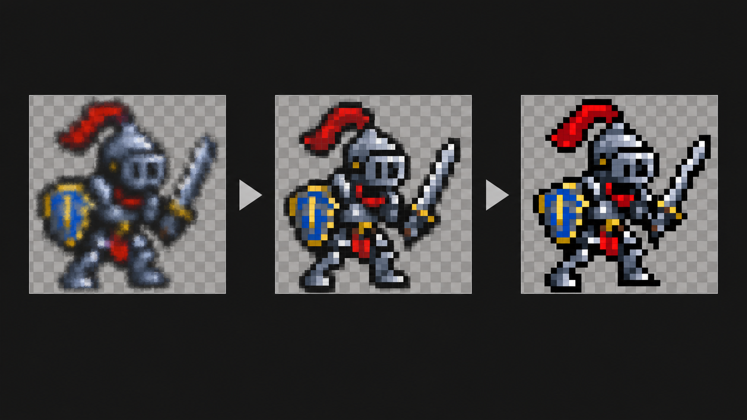
The four fundamentals
Every good pixel-art tutorial says roughly these four things. They are worth repeating because beginners skip them in the same order every time.
1. Resolution — start smaller than feels sensible
Pick the canvas before you draw anything. 16 × 16 is the classic size for an item, an icon or a small character; 32 × 32 is where you go when you need armour, a face, or a stride with room to move. Bigger is not easier. Bigger is harder, because every extra pixel is one more decision you have to justify — and the charm of the medium comes from having so few pixels that each one has to mean something.
Treat the size as a commitment. In Tsubu the grid belongs to the asset and can't be changed afterwards: any size from 1 × 1 up to 256 × 256, with 16, 32, 64, 128 and 256 as one-click square presets. That's deliberate. A sprite that quietly changes resolution halfway through a project is a sprite whose sheet your engine will slice wrong later.
2. Palette — fewer colours than you think you need
A small palette is the strongest beginner lever there is. It forces contrast decisions, keeps your shading readable at 32 pixels tall, and makes a whole set of assets look related. Ten to sixteen colours is plenty for one sprite. Think in ramps: for each material a dark, a mid and a light tone, and reuse a ramp across materials rather than inventing a new one every time.
You don't have to invent a palette either. A new project in Tsubu starts on Sweetie 16 — GrafxKid's sixteen-colour palette, one of the most-used in the scene — and every blank canvas you start in that project inherits those swatches. Swap in your own whenever you like; the point is that a project has a palette rather than sixteen unrelated ones.
3. Silhouette — the shape does the work
Block your character in as one flat colour before you shade anything. If the black blob doesn't read as "knight, sword raised, facing right" at actual size, no amount of highlights will rescue it — a player recognises the shape first and the details never, because the sprite is thirty pixels tall and busy walking.
The working version of this rule is: keep looking at the art at 100 %. Zoomed in you are moving squares around; at actual size you are looking at the thing your game ships. Beginners spend hours at 800 % and are surprised by what they get.
4. Consistency — the thing that reads as "professional"
A game's art looks good mostly because it looks like it came from one hand: the same palette, the same outline treatment, the same light direction, the same resolution family across every asset. Ten consistent, ordinary sprites beat one gorgeous sprite standing next to nine strangers. If you only remember one thing from a beginner tutorial, remember that consistency is a decision you make once and then keep, not a skill you acquire.
What a game needs that a picture doesn't
Four requirements sit on top of the craft, and they are the ones most tutorials leave out because they belong to the engine rather than the art.
- Grid-true pixels. Every pixel is one real pixel. A 1024 × 1024 image of large soft squares is not a 32 × 32 sprite — it's a photograph of one, and an engine will treat it as a big blurry texture. Pixel-true, not pixel-style: if you want the sprite to be 32 px, the file has to be 32 px.
- A genuinely transparent background. Alpha, not a white square and not "nearly the colour of my level". In the editor the checkerboard is the truth: whatever stays checkered is a hole in your sprite, and that hole is what lets it stand in front of a background instead of on top of a card.
- One fixed frame size. Every frame of an animation, and ideally every character in a set, shares a canvas. Fixed cells are what let an engine slice a sheet on an honest grid instead of guessing.
- An export the engine can read. A PNG at an integer scale, upscaled with nearest-neighbour so the pixels stay square, with the transparency intact. Then one setting on the engine side: switch the texture filter to nearest / point, or your careful edges get bilinear-blurred on import.
That engine side has more to it than a beginner guide should swallow — canvas sizes, sheet layout, per-engine import. We keep it in one place: making pixel art for your game engine covers the Unity, Godot, Phaser and Pixi workflow end to end, and pixel art for Godot goes deeper on the Godot import path specifically.
Make one: from a first pass to a game-ready sprite
Everything below happens in the real editor. Any pixel editor can do the craft parts of this, and Aseprite is the desktop standard for good reason; what follows happens in Tsubu because it runs in a browser tab with nothing to install. Sign in with Google and the whole studio is free for early adopters while we're in early access, with AI usage sponsored by the platform and no credit cap.
1. Make a project, then an asset. New project in the left sidebar, then New asset. Set Type to Image, name it knight-base, set the grid to 32 × 32, and hit Create. That's the blank-canvas path: pencil (B), one colour, and the silhouette rule above. It is the honest way to learn and you should do it at least once.
2. Or start from an AI first pass. Optional, and it is a draft, not a delivery. In the same dialog, flip Generate with AI on — the grid collapses to the square presets (16, 32, 64, 128, 256; 32 is the default), the button becomes Generate, and you describe what you want instead of drawing it. The card appears in your library as Queued, then Generating, and the sprite lands in its place. Here's what came back for "A small armored knight with a readable game-sprite silhouette, facing right" at 32 × 32:

That's the actual file at actual size: 32 × 32, sixteen opaque colours, transparent background. It looks tiny because a 32 × 32 sprite is tiny — every other picture in this post is a zoom.
It is also a first pass. The AI drafts; you finish — that's the discipline, and cleaning up a draft happens to be the fastest way to find out where the decisions live. Two honest notes before you lean on it. It's opt-in: the blank-canvas path is the same tutorial from step 3 onwards. And the provenance question — what these models were trained on — is unresolved on our side; we'd rather say so plainly than wave it away, and if you ship AI-drafted work, say so in your credits.
3. Open it and put the grid up. Click the card's thumbnail (or Open in its menu). The editor opens with the sprite on the transparency checkerboard, the tool rail down the left — pencil B, eraser E, fill G, eyedropper I, select-and-move M, pan H, zoom Z — and the palette on the right. The grid overlay appears on its own once each pixel is at least eight screen pixels wide, and the grid button in the top bar pins it on or off.
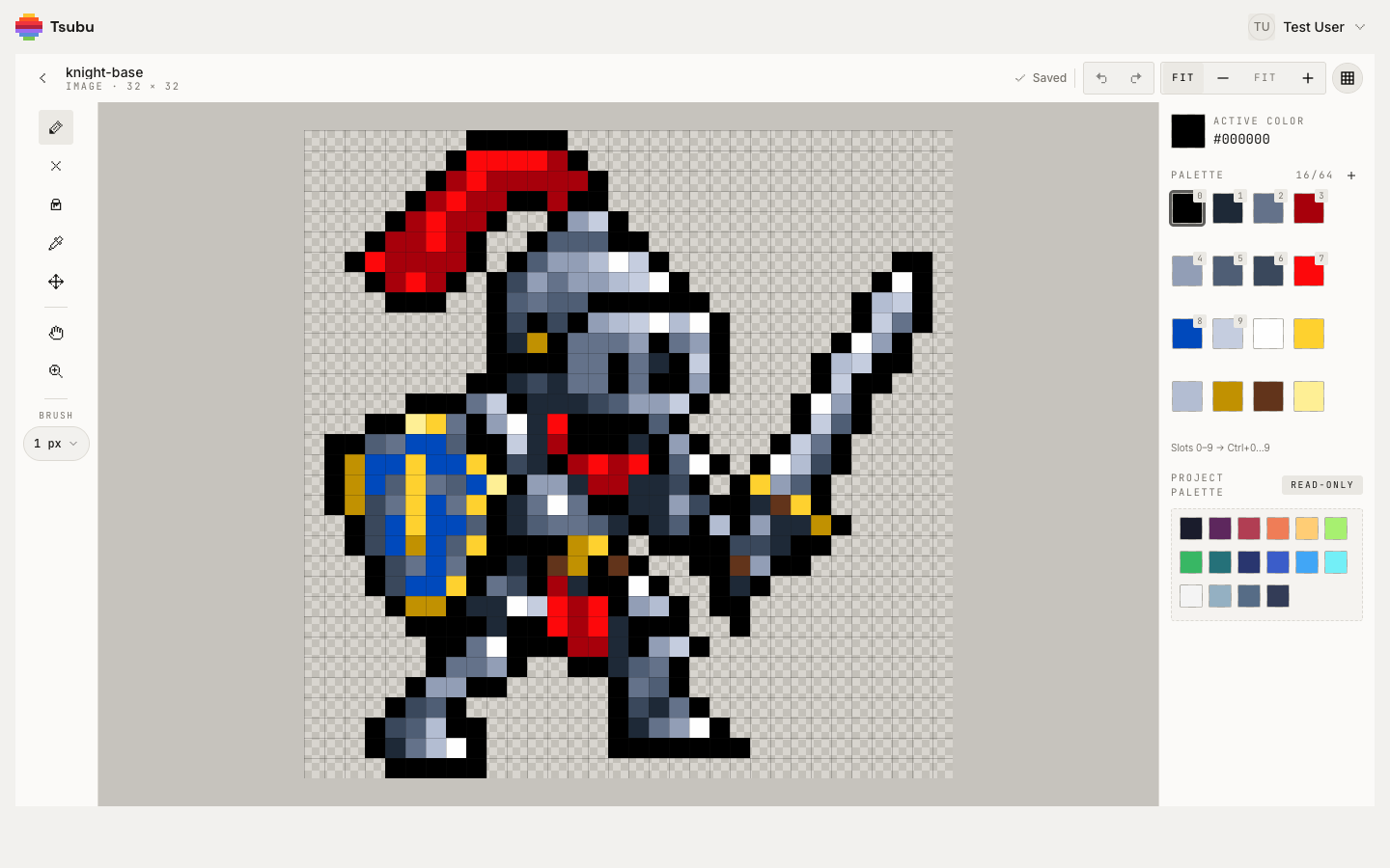
That's the base sprite open and ready to be refined. The header reads knight-base · IMAGE · 32 × 32, the brush is at 1 px, and the panel says PALETTE 16/64 — those sixteen swatches are the sprite's own colours, most-used first, so slot 0 — Ctrl+0 — is already the colour you'll paint with most (slots 0–9 map to Ctrl+0…9). Underneath sits the project palette as a read-only shelf you can pull swatches from, which is how a whole project stays on one set of colours.
4. Silhouette pass. Zoom in and walk the outline. Erase the pixels that blur the shape, add the ones that state it: a shoulder that reads as a shoulder, a sword that stays one clean diagonal instead of a stair with a wobble in it. Work at 1 px — the brush goes 1 to 4 px with [ and ], and at this size you'll live on 1. Ctrl+Z undoes a stroke, and every stroke from press to release is a single undo step, so you can be brave.
5. Palette pass. Count your colours; the counter is right there in the panel. Near-duplicates are the usual mess — three greys where two would do. Pick the keeper with the eyedropper (I, or hold Alt while a paint tool is active) and paint over the odd one out. The bucket (G) fills the contiguous run of exactly that colour and won't cross a diagonal, which doubles as a free diagnostic: if a fill leaks out of a shape, your outline has a hole in it, and a hole in the outline is a hole in the silhouette.
6. Transparency pass. Go back around the edges with the eraser and check that everything outside the character is checkerboard. Stray half-committed pixels around a sprite are the classic "why does my character have a grey halo in-game" bug, and they are much easier to see now than after import. Need to shift a whole limb a pixel? Marquee it with select-and-move (M), drag it, Enter to bake it down, Esc if you change your mind.
7. Judge it at 100 %. Step the zoom down until the readout says 100 % and look at the sprite at the size it will actually ship. This is the only review that counts. Anything that doesn't read here — a face that turns to mush, a weapon that disappears into the body — goes back to step 4. Work saves as you go; the header shows Saved when it's stored.
8. Export it — from the library, not the editor. There's no export button in the editor; head back with the chevron at the top left (Back to library), find the card, open its actions menu (the kebab, or right-click the card) and choose Export.
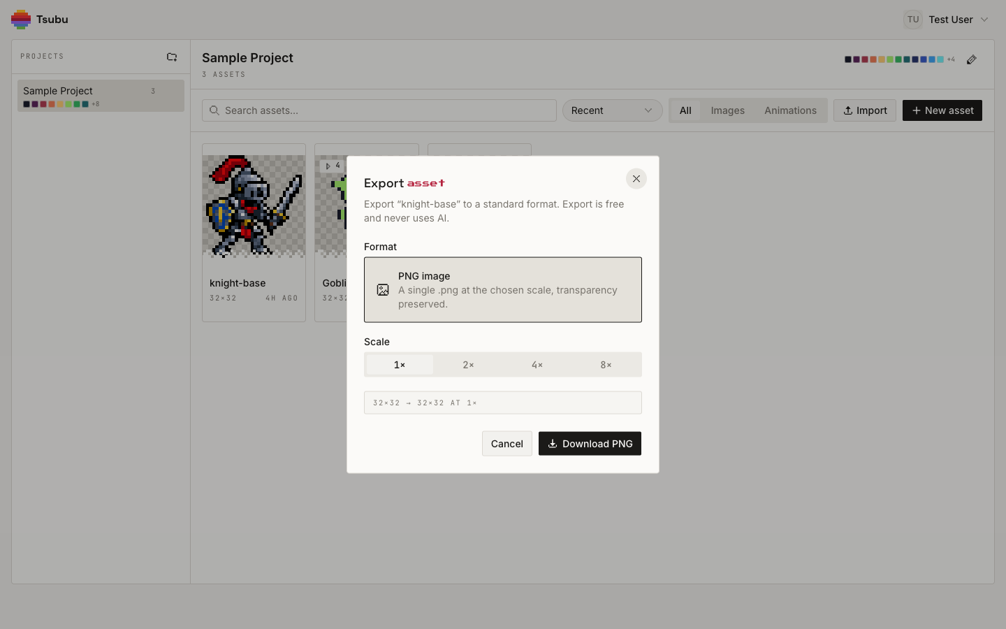
For a single sprite the format is PNG image — "a single .png at the chosen scale, transparency preserved" — with a Scale of 1×, 2×, 4× or 8× and a readout telling you exactly what you'll get: 32×32 → 32×32 at 1×. Export at 1× and let your engine do the scaling; that's the version that stays honest. The bigger scales are nearest-neighbour upscales for when something downstream wants chunkier pixels — a store page, a devlog screenshot, a tool that refuses to zoom — and they arrive named @2x, @4x, @8x so you don't confuse them later. As the dialog says: export is free and never uses AI. It's built from pixels your browser already has.
One thing worth knowing before you go looking for it: PNG is the export for a single image. An animation exports as an animated GIF or as a sprite sheet — a .zip with the packed sheet PNG and its JSON atlas — and never as a lone PNG.
Where this goes next
You now have one game-ready sprite and, more usefully, a checklist you can run on the next one: right size, small palette, readable silhouette, clean alpha, exported at 1×.
- Make it move. How to animate pixel art builds a four-frame walk cycle from a single pose in the same editor, and covers frame counts, FPS and what to do about onion skinning.
- Pack the frames. When you have an animation, how to make a sprite sheet walks through the sheet-plus-atlas export, and the sprite sheet maker does the packing job on frames you already have.
- Get it into your engine. Pixel art for games is the engine-side overview; pixel art for Godot is the deep version for Godot 4.
- Draft the boring ones. If you'd rather not draw a fifth crate by hand, the AI pixel art generator is the same first-pass path used in step 2 — grid-aligned, transparent, and yours to edit afterwards.
Now go make a sprite
The gap between "I can't draw" and "I have a sprite in my game" is smaller than it looks, and almost none of it is talent. It's four decisions — size, palette, shape, consistency — plus a clean export, repeated until you have a set.
Open the editor and make your first game sprite — free while we're in early access, sign in with Google. New workflow guides land on the RSS feed.